Wanderlens
TrekTogether is a dynamic tech startup founded by a group of avid travelers and software engineers. Frustrated by the lack of a dedicated platform for sharing authentic travel experiences, they set out to create a social media app that would revolutionize how people connect through their wanderlust.
Timeline
Type of Work
Tools Used
My Role
May - June 2024
Affinity Mapping
Persona Creation
Mobile App Design
Usability Testing
Quantitative and Qualitative Analysis
Figma
Miro
Zoom
UX Researcher
UX Designer
They are seeking a UX designer to design their app, Wanderlens, that combines cutting-edge social networking features with practical travel tools (such as booking), allow users to share their journeys, discover hidden gems, stay informed, and plan their next adventures all in one place.

Affinity Map
I gathered research provided by a secondary source.
First, I gathered the sticky notes based on key words. For example, “safe” and “meet” are keywords that often popped up.
After grouping them, I named the groups costs, meeting people, discovering new places, safety concerns, challenges during the trip, independent vs. group travel, and misc. (where I couldn’t find other sticky notes similar to these).

Personas
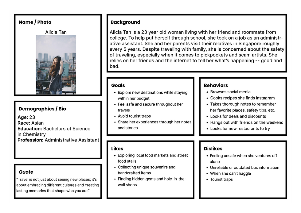
The most important pieces of information that I used to build these two personas were the categories that gave the most information. For example, safety was a huge concern, so I tried to hone in on that and create two users that had safety at the forefront of their minds.
I noticed that the information from the affinity map kind of diverged in that some sticky notes (“I like meeting other travelers”, “I have more freedom in a group than alone”, etc.) presented a more extroverted experience and other sticky notes (“I want to push out of my introvert shell when traveling”, “I have traveled for half a year solo”, “I sightsee alone often”, etc.) presented a more introverted experience.
I chose to represent these in my personas by making the young woman travel with family, but still wary about the safety of traveling, and the older man travel solo.

Personas, cont.
Ideating Solutions
I proposed 4 potential solutions to tackle the problem. I think that combining the 4th and 2nd ideas would be good to move forward with. The main function would be social media, but it can also display a page and send push notifications to the user’s phone to alert them of any travel advisories.
An app similar to Yelp or Google Maps, but only verified users can leave reviews (to get verified, the user would have to enable their location). This will help cut down on spam reviews and provide more authenticity
Solution 1
An app that provides real-time safety alerts. The safety alerts and travel advisories are based on the user's location and leverages data from government agencies, local authorities, and user reports to provide quick warnings about potential risks or incidents.
Solution 2
A virtual assistant that acts as a personal travel companion providing safety tips, emergency contact information, and guidance based on the user's location and travel itinerary.
Solution 3
A social media app that serves as a social networking platform for travelers to connect, share experiences, provide cultural insights, and vouch for safe destinations. Users can join locations based on communities, read reviews from trusted sources, and get personalized recommendations from like-minded travelers.
Solution 4
Context
In today's fast-paced world, people are increasingly seeking meaningful connections and unique experiences through travel. However, planning trips, sharing travel memories, and staying up-to-date with important travel advisories can often feel disconnected and fragmented across various platforms.
Problem
As a young adult, I want a way to vouch for places and destinations so that I can stay safe and have an enjoyable experience.
How might we provide our users with a way to vouch for places so that they don’t have a negative experience whilst traveling?
Solution
Design a dedicated travel social media app that addresses these pain points by providing a centralized space for travelers to come together, plan their adventures, build lasting bonds, and stay informed over their shared passion for exploration.
Sketches

My Trips Page
Phone screen layout: Top: Trip Name, Destination, Attendees (all editable) Middle: Itinerary, Popular Places, Communities Thumbnail: Name, Dates, Modify, Remove Bottom: Cancel Trip button Navigation bar: My Trips, Communities, Alerts, Account Notes: Trip cancellation notifies attendees Cancellations restorable via settings

Community and Alerts Pages
Community Page: Header: Community Name, "Join" button Content: Top Users, Top Posts, Filter Post layout: User icon/name, options, text/image, heart, share, Report Bottom: Navigation bar Note: Filter options - top of week, new, trending Alerts Page: Official Alerts (2), "View more" button User Reported Alerts (2): User icon, description "View more" and "Add report" buttons Bottom: Navigation bar Note: "View more" shows alert details

Account Page
Account Page: Header: User icon, name, bio Buttons: Edit, Deactivate Account Tabs: All, Posts, Comments Content: Recent posts display Bottom: Navigation bar Note: "All" includes posts, comments, and saved posts
Prototype Details
I've highlighted the points of interest for some pages. The points of interest are as follows:


Prototype Overview
I have expanded the pages beyond the initial 5 pages of the wireframes and chose to focus on providing a high-fidelity prototype for the users to interact with. I think that providing a high-fidelity prototype would be better for the users to idealize what the final product could look like. A low-fidelity or paper prototype can look unpolished and unfinished. It could be difficult to explain what some functions are or what could be possible with a low-fidelity prototype. Also, having a non-paper prototype would open up the user base I can recruit from. I can provide a remote usability testing option for the users who I know are not located in my city. I used Figma to design the prototype and build the interactions between the pages.
Recruiting Participants

Participant 1
Used Safari on an iPhone 14

Participant 2
Used Google Chrome on a Windows PC

Participant 3
Used Safari on an iMac

Participant 4
Used Google Chrome on a Windows PC
I recruited 4 participants who: are 18 years old and older, have access to a smartphone with a reliable internet connection, and have traveled more than 50 miles from their permanent address within the last 2 years.
Usability Test Protocol and Metrics
Participants provided written and verbal consent before each remote session. The sessions lasted about 30 minutes. Participants completed pre-test, post-task, and post-test questionnaires via Zoom Surveys.

Environment
-
Audio & video of the sessions were captured remotely via Zoom.
-
Surveys were created on Zoom and launched at the appropriate times during each session.
-
Notes & insights during the session were taken using Miro.

Metrics:
Each session evaluated the usability of the mobile website quantitatively and qualitatively in terms of its core components by measuring effectiveness, efficiency, and satisfaction.
-
Effectiveness - Measures the completion rate of each task
-
Efficiency - Measures the completion rate of each task in terms of the user's ability to use as few resources as possible
-
Satisfaction - Measures the overall desirability & usability factors of the site using user perception

Tasks for testing the prototype will address:
-
Navigation and discoverability of information on a destination through the community and alerts feed
-
Ease of planning a trip to go from destination A to destination B
-
Ease of adding information to be accessed by other users in the destination’s community

Task 2 Compilation
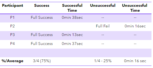
Objective: Browse the app’s community feed for Bora Bora and like or save at least 2 posts that interest you.
The %/Average for the success/unsuccessful columns are based on the participants who had a full or partial success vs. those who had a partial or full fail.
The %/Average for the time columns are based on the total average time for all the participants who were successful or unsuccessful in completing the task.

Task 1 Compilation
Objective: Plan a trip to Bora Bora on July 8 through July 13. Add at least 1 hotel and 1 event or sites to the itinerary.
The %/Average for the success/unsuccessful columns are based on the participants who had a full or partial success vs. those who had a partial or full fail.
The %/Average for the time columns are based on the total average time for all the participants who were successful or unsuccessful in completing the task.

Task 4 Compilation
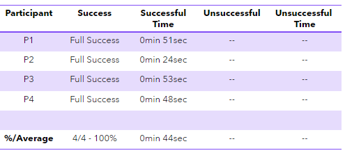
Objective: Upload a photo to Bora Bora’s community page.
The %/Average for the success/unsuccessful columns are based on the participants who had a full or partial success vs. those who had a partial or full fail.
The %/Average for the time columns are based on the total average time for all the participants who were successful or unsuccessful in completing the task.
Analysis

Affinity Map
To make sense and organize the qualitative data the participants provided, I chose to do an affinity map. The affinity map grouped all the observed participant quotes, steps, and other findings into 9 categories: gathering more info (participants want to learn more by reading), expectations (will inputs lead to the output they are used to seeing in other apps?), successes/fails (whether participants succeeded or not in completing the task and their completion times), actions (inputs whilst navigating the prototype), positive feedback ("I like" statements or other feedback), Figma and prototype errors (glitches and other problems viewing the prototype that was not the result of the participant nor moderator), perceived confidence (how confident the participant was that they could complete the task, after the task was done), perceived difficulty (how difficult the participant rated the task after completing it), and misc. (such as which browser was used to complete the test).

System Usability Scale (SUS)
I made use of the System Usability Scale (SUS) to measure the perceived ease of use and usability of the prototype. The prototype design had an average of 91.87 for all participants, which is above the average score of 68 for the usability of applications. This would mean that my prototype is well above average in terms of satisfaction and usability.
Observations and Recommendations Across the Tasks
Observations and Recommendations Across the Tasks
Task 1
Observations: Participants 2 and 3 partially succeeded. The "foods" and "activities" tabs may not have been clearly selectable. All participants tried to click hotel/activity images for more details.
Recommendations: Make the "foods" and "activities" tabs more prominent. Add image scrolling functionality.
Task 2
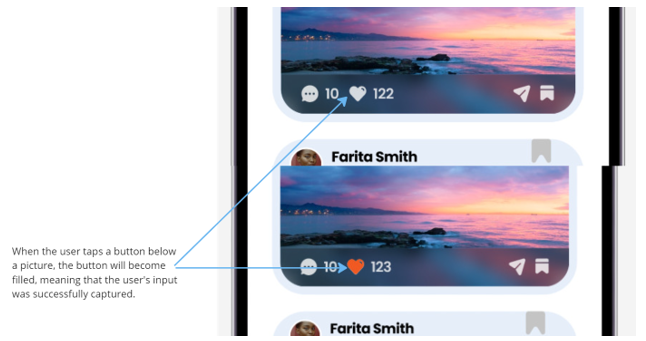
Observations: Participants 2-4 attempted to click on the heart and comment icon of the photo to view more information about the post. Perhaps liking/saving a post can be interpreted differently for others than for myself.
Recommendations: Consider implementing a way for more buttons to provide feedback to the user upon clicking on them.
Task 4
Observations: Participant 4 scrolled up and down the community page for confirmation that the picture was uploaded successfully.
Recommendations: Consider adding a page in the prototype that reflects the upload or a way for the user to upload the picture to their profile page and share it to different communities from there.
Next Iterations

Change #1
This is a paragraph area where you can include any information you’d like. It’s an opportunity to tell a story about the business or describe a special service or product it offers. You can use this space to share the company history or highlight a particular feature that sets it apart from competitors.

Change #2
This is a paragraph area where you can include any information you’d like. It’s an opportunity to tell a story about the business or describe a special service or product it offers. You can use this space to share the company history or highlight a particular feature that sets it apart from competitors.
Let the writing speak for itself. Keep a consistent tone and voice throughout the website to stay true to the brand image and give visitors a taste of the company’s values and personality.
Final Thoughts
All in all, I really liked completing this design challenge. It was a good way to also test my knowledge from the usability testing project I've done in January through April 2024 with implementing some of the same methods during the usability testing sessions for this project.
The thing that stood out to me the most was some of the participant's curiosity about aspects outside of the given tasks. For instance, they provided substantial feedback on interactions I didn't think to include because they weren't task-related. I appreciate that.

Task 3 Compilation
Objective: View the alerts for your upcoming trip to Bora Bora.
The %/Average for the success/unsuccessful columns are based on the participants who had a full or partial success vs. those who had a partial or full fail.
The %/Average for the time columns are based on the total average time for all the participants who were successful or unsuccessful in completing the task.